Transformed the Santorini Island Grill mobile & desktop websites to revitalize the brand for business client, the president of Santorini.
My Responsibilities: Conducted user interviews & competitive analysis, created personas, wireframes, site architecture, & iterated on low to high-fidelity prototypes.
Duration: Jan - Mar 2020 (10 weeks)
Role: UI / UX Designer
Tools: Figma, Balsamiq, Miro
Santorini Island Grill is a chain Greek restaurant with three locations in San Diego and one in Santa Barbara. For my Practicum in Web Design Course, my team and I reached out to the president of Santorini, Takis, and offered to redesign the existing desktop and mobile website over the course of 10 weeks. He gladly accepted our offer as he also wanted a complete revamp of the current website.
The current website had a number of things that could be improved upon. The main issues included:
The overall website lacked a distinct brand & aesthetic appeal.
The site was hard to navigate & had difficult to read menus.
It was not up to date & included inaccurate information.
We first interviewed our client to get a better understanding of his objectives, branding, and information about the restaurant. We compiled a list of questions to ask him, such as what he would want users to learn about Santorini after visiting the website, his current frustrations with the website, and features he would want to be implemented.
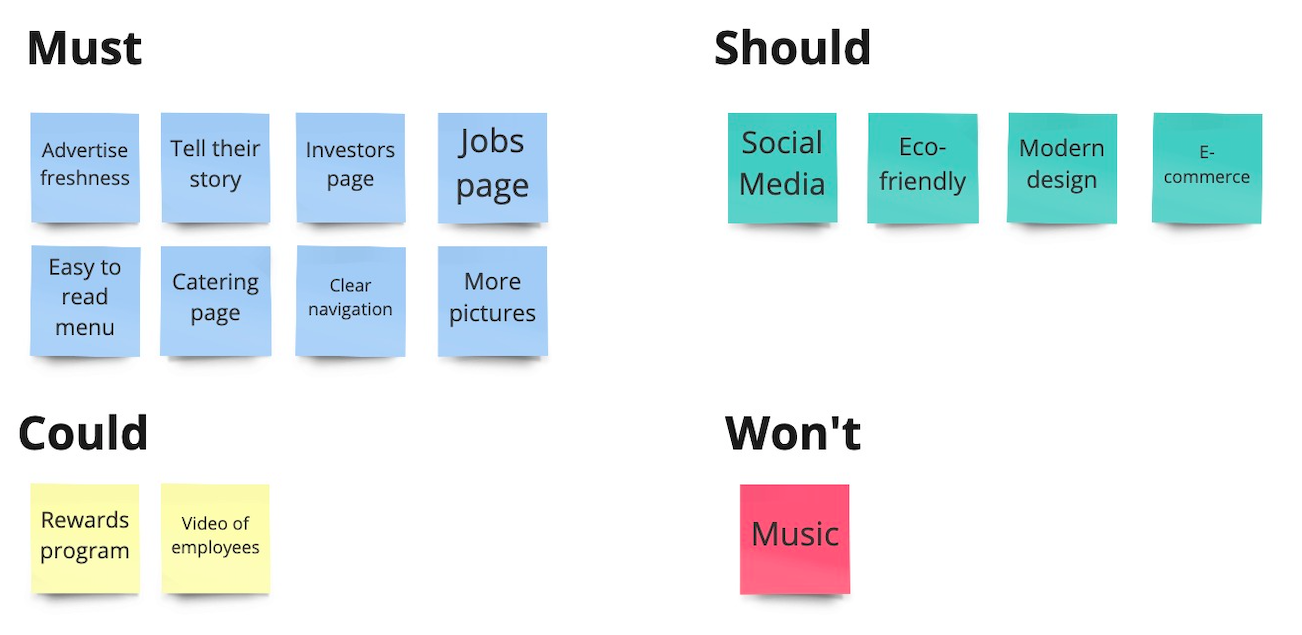
From his answers, we came up with a priority list for the redesign and used the MoSCoW method to categorize them and see what features we should focus on for the redesign.
Next, we conducted user interviews with 9 participants from the UCSD community. We focused on the Santorini located at UCSD's Price Center because our client wanted to reach out and expand to other universities. So we interviewed people from the UCSD community to get more relevant data for his target audience of university students. Some questions we asked included:
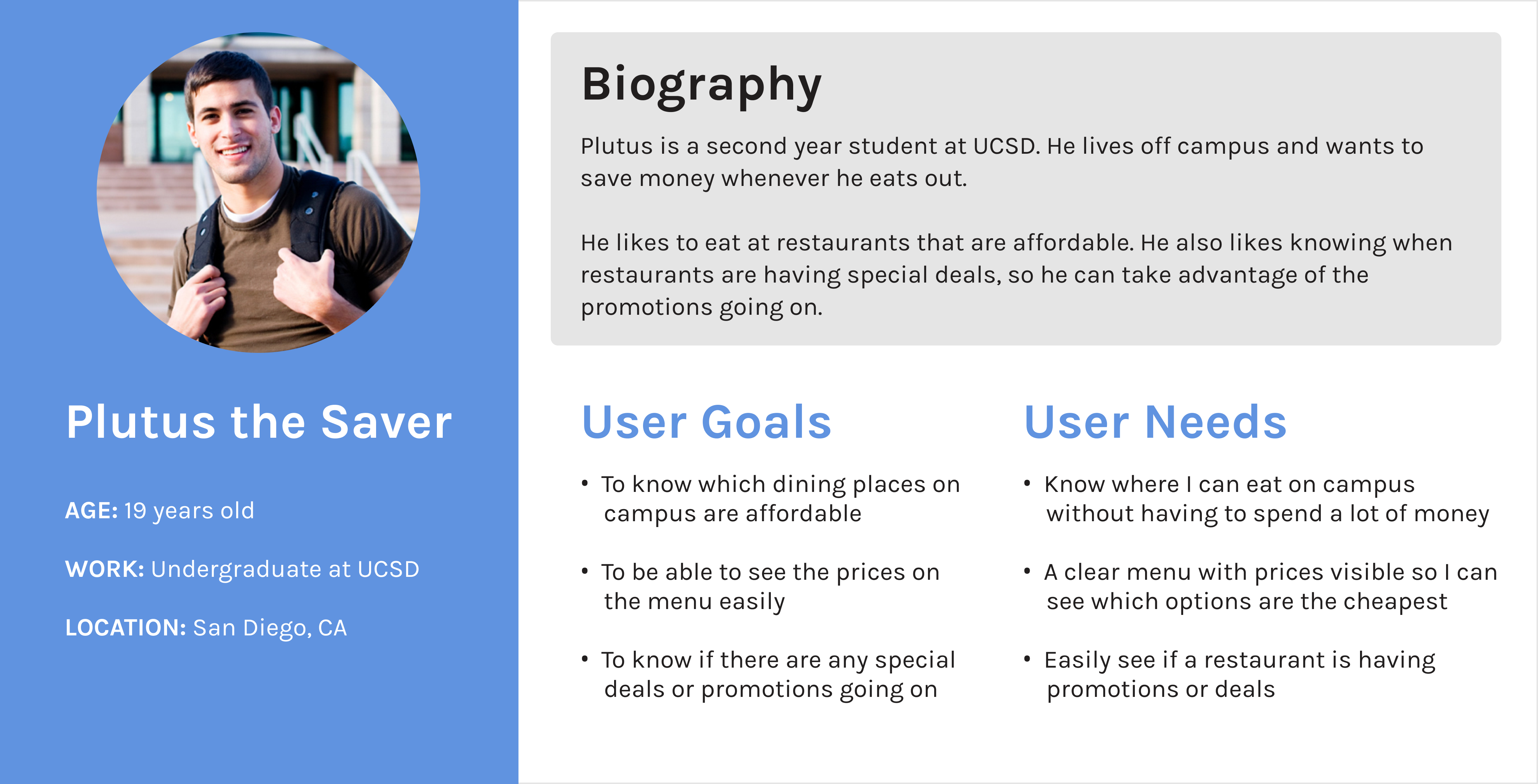
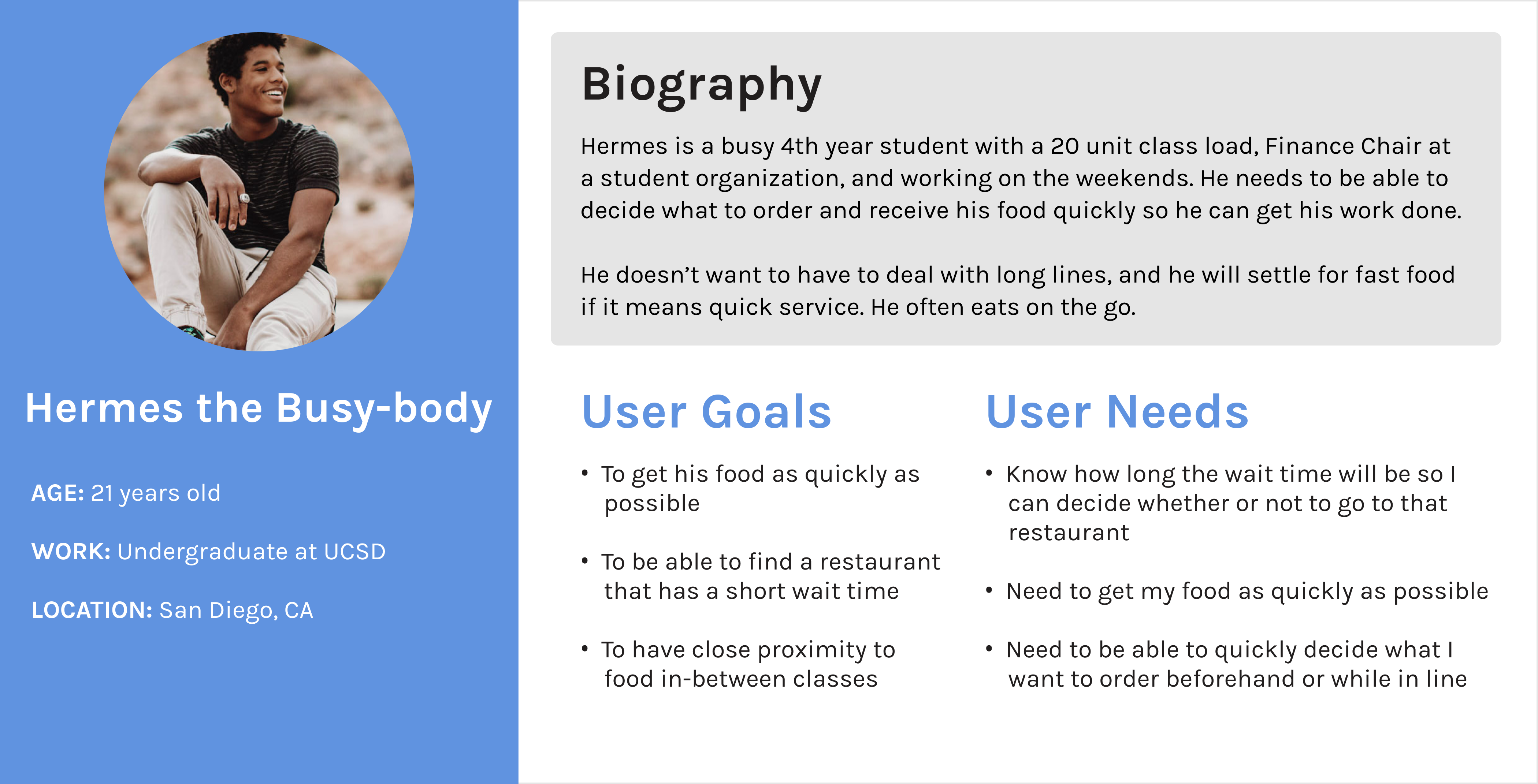
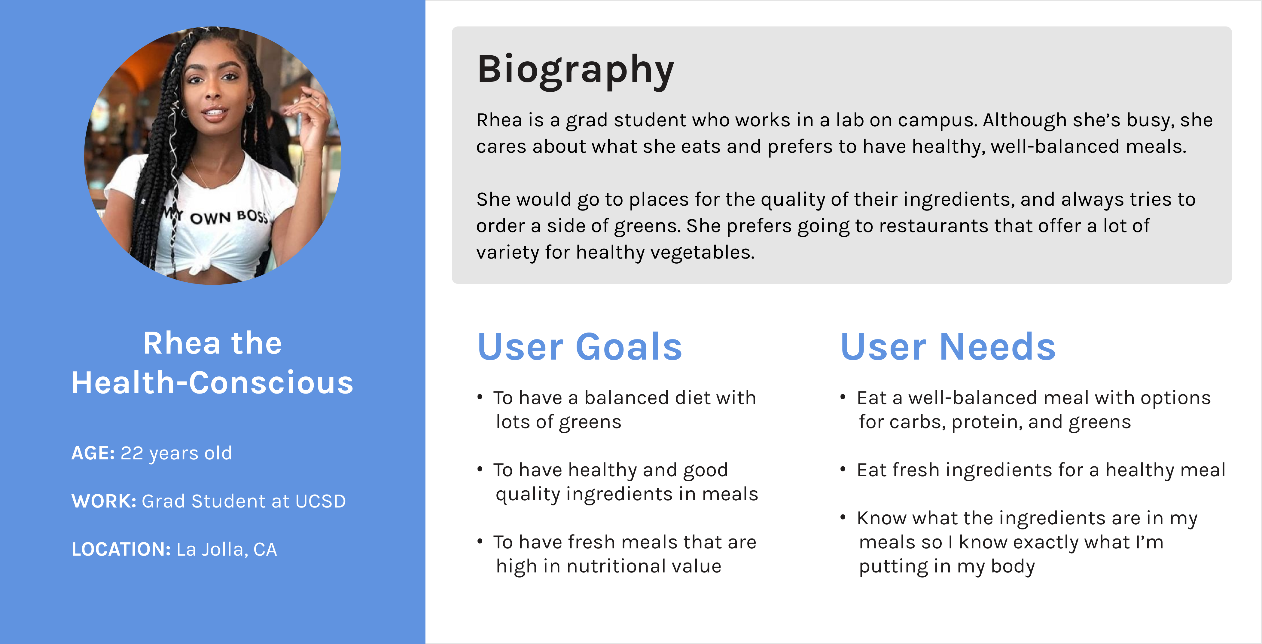
From the interview data we gathered and trends we observed, we compiled the data into 3 distinct user types: savers, busy-bodies, and health-conscious, and created personas based off of them.
We chose 5 of Santorini Island Grill's competitors to analyze both their mobile and desktop sites and put together a competitive analysis, separated into branding, functionality, site architecture, content, and overall good design ideas to inspire us for our redesign of Santorini's website.
We also put together several mood boards that represent the theme, culture, color palette, and overall aesthetic of Santorini's website. We wanted to include colorful pictures of food and Santorini islands to communicate the freshness of the food and the Greek Islands' beautiful landscape.
Communicate that Santorini provides fresh, high quality food at a great price point.
Santorini's president plans on expanding to more university locations.
Make it easy for customers to navigate the website to find what they're looking for.
Before we started to work on the design of each page, we created a site map, showing all navigation labels and the topology of how pages are connected.
We then sketched out low-fidelity designs of the mobile website to show the layout of each page, the navigation, and the footer. Next, we created wireframes to show all the functional specifications and interactivity we wanted our prototypes to include.
After we created a working prototype of our website, we conducted usability testing with 9 participants. Tasks included finding out what time a restaurant closes, finding the address, ordering online, finding where to buy sauces, ordering catering, and downloading the job application.
We tested on mobile first, and then desktop. Some users struggled with a few of the tasks we had for them, making it clear what we needed to work on in order to improve their experience. After each usability test, we took the feedback we received into consideration and iterated on our prototypes, so each user saw a slightly new and improved version of our prototype.
We explored the idea of adding tags in the location cards, but they were confusing for our users. We didn't think it was necessary to include them in our final design and removed them, focusing on the main infomation users thought were valuable and needed to see.
We wanted to use dropdowns for Locations and Menus in the navigation, but ultimately decided to remove them on both mobile and desktop to make it consistent and easier to click for users.
Originally, we had every single page and the contact information in the footer. However, this overwhelmed the user with lots of information, so we decided to only focus on the information our users needed to access in the footer.
We felt it was difficult when our client's requests conflicted with our user needs and user testing results. We needed to design in a way that would satisfy our client and be validated by our research and user data.
We struggled with how to separate the pages on our site and where to place them, so we decided on this navigation design to highlight pages that were most important to our users and fulfilled the request of our client.
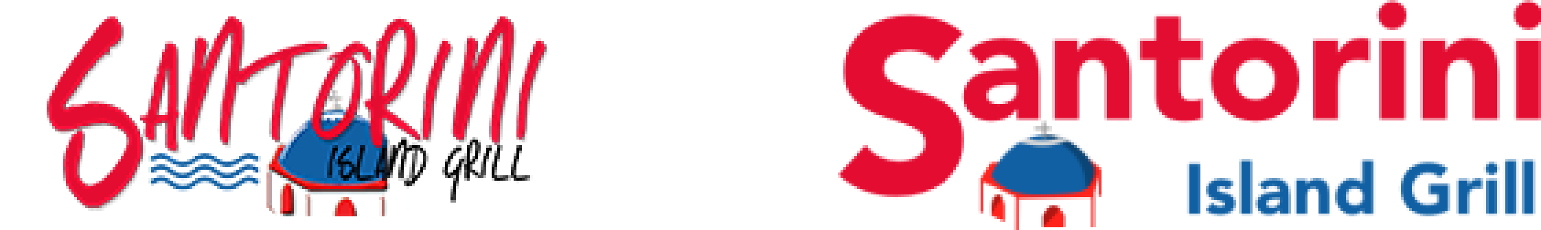
We used the current Santorini logo in our initial prototype. However, the logo looked messy and cluttered. Users were unable to read "Island Grill" in the logo (especially on a small screen on mobile devices). This is important since it's the name of the website.
We decided to redesign the logo and make it cleaner by taking out the water in the old logo and straightening out the letters so it didn't overlap with other elements in the logo, making it easier for users to read. Overall, we made it look more modern, while maintaining the color scheme and visuals to convey the brand.
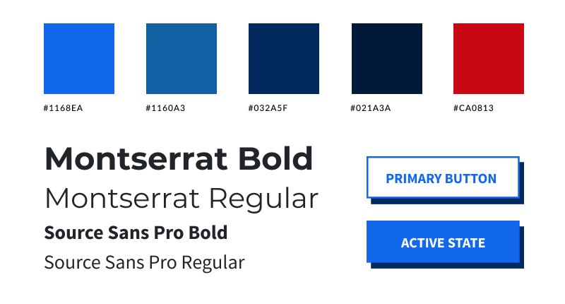
We chose colors that use the Mediterranean blues, bright red, and white to reflect the Santorini brand. We wanted our redesign to represent the aesthetics of Greek culture, and be eye-catching, colorful, and modern.
Feel free to play around with the mobile prototype below! Link to desktop prototype here.
It was difficult to get the content we needed from Santorini's president, but I learned that we just needed to be persistent and keep asking him. I also learned to check in frequently with our client, getting feedback early and often and being transparent about what you need is key.
It was challenging to balance both client expectations as well as user needs, especially when they conflict with each other. The feedback we received from user testing was very valuable and helped us focus on what to improve on in our prototype iterations.
This was a quarter long project that went remote in our last 2 weeks due to COVID-19. As we were adapting to the transition of suddenly coordinating work online, we did not have enough time to cover everything we wanted to. If we had more time, we would explore other potential features, such as: